
Build A Dash Web App For Binary Classification Model Selection
Automatically curate a compilation of machine learning visual diagnostics
This post demonstrates a use case of a classifiers-dash web app tool I developed to automatically curate a compilation of machine learning visual diagnostics for binary classification problems. This web app offers established practitioners efficiency gains and enhanced interactivity in their modeling selection process. Further, budding data scientists and machine learning engineers can capture an extra benefit of honing their intuition of common classification assessment scoring metrics and benchmarking.
Inspiration
Inspiration for this post and web app is from an issue on the Yellowbrick project “to create an at-a-glance representation of multiple model scores so that I can easily compare and contrast different model instances.” Such a tool also helps the analyst gain an intuition for algorithm selection before moving on to the hyperparameter tuning stage.
Leveraging the interactivity of Dash by Plotly, I extended the concept to incorporate existing Yellowbrick classification visualizations, named visualizers. A snapshot of what we will be using for this use case can be found in the header image above.
Use Case
The data used in this example is the ‘default of credit card clients Data Set’ from the UCI Machine Learning Repository. The dataset consists of customer default payments in Taiwan. We’ll be using it to score model performance on the binary result of classification — credible or not credible clients.
The dataset includes a binary variable, “default payment”, as the response variable. There are 23 predictor variables that consist of demographic information, history of past payments, amount of bill statement, etc.
The data has already been cleaned, so we can move on to the fun part — modeling!
Model for Model Selection
Before diving into the tool, it’d be helpful to provide the context for where in the workflow this tool will be most useful. I’m a fan of the Model Selection Triple framing provided by Arun Kumar et al. [1]
The three stages are:
Our use case resides within the “Algorithm Selection” stage, as we’ll use the web app to narrow down the search space rather than performing an exhaustive search.
So why a dashboard to analyze model performance? Because visual diagnostics are critical to building intuition for more effective machine learning!
..And the interactivity of the dashboard can lend itself to a more seamless UX experience since you can avoid the seemingly infinite scroll when reviewing models’ performance output in notebooks. This scrolling intensive exercise is especially true if there are a lot of supporting data visualizations.
Installation
To start off, clone the Github repository
git clone https://github.com/taylorplumer/classifiers-dash
After creating a virtual environment (recommended), you can install the dependencies with the following command:
pip install -r requirements.txt
Configurations
config.py will be the most hands-on file as this is where we’ll make the configurations necessary for the problem at hand.
In this use case, we’ll be exploring a variety of popular algorithms for binary classification that are available as sklearn estimators such as Gaussian Naive Bayes, Logistic Regression, Random Forest, and Gradient Boosting.
The Yellowbrick visualizers used are pulled from the suite of existing classification visualizers.
*Note that any sklearn estimators and/or yellowbrick visualizers inputted that are not provided by default in the cloned repo will need to be imported.
Data Processing
Run the following command in the project’s root directory to set up the data and images. The target variable should be the first column int the csv file followed by however many predictor variables.
python3 process_data.py credit.csv
The saved output will be the following:
- A csv file of model scores for each model from sklearn.metrics.classification_report
- The Yellowbrick visualizations saved as png files.
Dash Application
Before describing the components, let’s run the Dash Plotly web app.
python3 app.py
The app will run locally at http://127.0.0.1:8050/ (or whichever port you selected). We’re live!
A demo deployed to Heroku is available for viewing at the following address: https://classifier-dash-app.herokuapp.com/
The demo is not mobile friendly so please view on desktop/PC for full functionality.
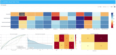
The web app consists of three components:
- A dropdown allowing the user to view models with training data either as-is or synthetically upsampled to address any class imbalance.
- The default is no upsampling
- The upsample.py module within the utils directory can provide details on the upsampling method.
- A heatmap containing precision, recall, and f1 scores for each sklearn model along with the following:
- macro average: averaging the unweighted mean per label
- weighted average: averaging the support weighted mean per label
- When hovering over associated row in heatmap for sklearn model, model-specific images of matplotlib plots will appear that were populated from utilizing Yellowbrick classification visualizers.
- ROCAUC: Graphs the receiver operating characteristics and area under the curve.
- Precision-Recall Curves: Plots the precision and recall for different probability thresholds.
- Classification Report: A visual classification report that displays precision, recall, and F1 per-class as a heatmap.
- Confusion Matrix: A heatmap view of the confusion matrix of pairs of classes.
What does it tell us?
We can see clearly that the Gaussian naive Bayes model does not perform well (at least with the given set of parameters). The logistic regression model is biased due to the class imbalance and performs poorly on precision and recall for positive cases. We see that it performs better when the upsampling is applied to the training data, but it still doesn’t reach performance similar to either of the ensemble methods represented by the random forest and gradient boosting models.
The visualization is hinting at ensemble methods performing better but can we better distinguish between which family of ensemble methods is better — bagging or boosting? This could be done by editing the config.py file to incorporate extra-trees and AdaBoost classifiers.
The initial diagnostics also help inform us of how to allocate our time moving forward, i.e. looking into the decision trees for feature importance and then moving on to more exhaustive hyperparameter tuning within these algorithms.
Machine learning is an iterative exploratory process, so we’d likely be going back and forth between all three stages of the Model Selection Triple.
Next Steps
If you’re interested in what’s going on under the hood for the process_data.py and app.py files, then I encourage you to check out the github repo!
If you have any issues and/or ideas to make the tool more effective, then please open an issue. Happy coding!
[1] Kumar, Arun & McCann, Robert & Naughton, Jeffrey & Patel, Jignesh. Model Selection Management Systems: The Next Frontier of Advanced Analytics (2016), ACM SIGMOD Record. 44. 17–22. 10.1145/2935694.2935698.